"Reflex" is my final capstone project for Champlain College. It combines a heavily researched topic with a design campaign to examine how our visual culture now promotes a personal aesthetic, and how tools once held only by designers are in the hands of mass.
The following is my digital process book, with the exemption of my full research.
Proposal
Did We Kill Originality?
It is debatable whether or not the influence of the web and interconnection across the world has made a space that was once socially compartmentalized and separated now unified in a greater sense. That being said, some of the most forward thinking designers of our generation (David Carson, for example) believe that legibility doesn’t always mean communication, and that the world as we know it is visual now.
This leads one to question whether there is a new base visual-emotional sensibility, and how the emergence of social media and the web has made culture visual. In other words, what is the new standard for communication, is there one, and what have we done to originality? Furthermore, is the visual culture affective, and does it read?
Target Audience
My audience would be people who are involved in the shift to a visual culture but are aware of the change (I.E. have not been born into the visual culture). People that understand the switch will be much more likely to understand the points I will try to make, therefore it makes sense to be exclusionary and focus on an age group that makes sense.
18-25 seems like a good age range.
Scope
Ultimately my deliverables will aim to show that culture is visual now; I want the product to be a lot of information at once, almost like someone just got all of the Instagram news at once and they don’t know how to process it. It makes sense for the product to be edgier/aggressive; it’s for a relatively youthful audience, and access to the internet during youth is more frequent, giving exposure to imagery/concepts beyond the safety net that people can provide. I will need to let research show whether or not this is the right direction, but with this post-modernist thinking and this concept of a visual culture shift it seems like the right direction.
I can very much see this being a print series or even involving some motion in the product. The concept of having a small but strong caption to the pieces seems crucial as well; from the perspective of a designer, how much information can be translated at a quick glance effectively?
Framing Questions
How has the emergence of social media + the web + interconnection made culture visual?
Is there a base visual/emotional sensibility?
If our culture is visual now, do words matter? (I.E. David Carson)
What To Look At
Is there a standard visual vocabulary?
Who made it?
What have we done to originality?
Who else has tried to prove this thesis?
Pre and post-internet ideas of design principles (post-modernism)
Semiotics
The concept of a social media persona/aesthetic
Is there a base visual vocabulary across cultures, and how is it translated?
Research Lenses
Historical
I will be looking at postmodern thinking and how postmodernism shaped what has become our current visual language.
This will give background context to the piece and show where we came from, where we are now, and give an idea of where we are headed.
Cultural
If our culture is visual now, I’ll need to examine how we read things now. How do we, as a culture, receive our information? Why do we prefer to receive it this way? How does effect the way we “read” and how has this change people?
Semiotic
I will also need to look into the use and interpretation of visual signs and symbols; the emergence of social media has given non-designers the ability to create their own visual language and make it read across cultures. There is a lot of power there. I will be looking into the idea of how building a personal aesthetic creates more momentum and power behind the personality itself as well.
Visualization
A project visualization was undergone, a process in which a framework of what the final product could be was created for reference, to get thoughts on a page and an overarching concept of direction.
Visualization Moodboard

Visualization of Project

Branding
Word List
reflex
reflect
visualize
visualization
effect
echo
impulse
fallout
reverberation
The second round of name generation brought to light three different ideas; reflex, visualize, and echo.
Reflex creates concepts of involuntary reaction from a specified stimulus.
Visualize creates a literal conceptualization of what it means to represent something visually.
Echo creates a the idea of a visual echo, a trail the eye can follow to see where the initial motion formed.
Digital Sketches/Markmaking
A second round of markmaking took place, playing around with the concepts of broken letterforms to show the literal function of visualization, as well as the idea of a completely digital that cannot be printed and only exists within the world of a screen. Both of these options were explored to see which more clearly illustrated the research and overall feeling of the project.


Reflex
Name
“Alternatively, we might view the issue of visual culture as a hermeneutic one. It is not a question of one era superceding another or of binary opposites. There isn’t a clear historical break between, say, a literary era and the visual era” (Julier 66).
“the image [as a ‘dissociated transcript] not only makes society, society continually remakes the image” (Boulding 64).
After a second round of name generation, the term reflex was deemed as the best option for the branding. Reflex is defined as:
reflex (noun)
1.) an action that is performed as a response to a stimulus and without conscious thought.
2.) a thing that is determined by and reproduces the essential features or qualities of something else.
This ties quite literally into how I am trying to present what has come to be our visual culture. Connections between how information was received prior to our modernity isn’t a clear or quick transition, even though the effects may seem instantaneous. There also hasn’t been a clear action that has caused this; culture affects information reception and vice versa. On top of that, the same information is translated in our modern visual culture, bringing the essential features and qualities of the culture prior forward into the now.

Logo
“Electronic media served as an organic extension of the body’s nervous system, namely its instantaneous and simultaneous electric communications capability... Thus, by extension, systems of electronic delivery such as the television, the computer, and the Internet are organically linked to the body, as McLuhan suggests, hence enabling an experience of their digitized visual culture that is paradoxically vicarious yet impelling, as its ever-present images construct and determine our bodies’ choices and desires” (Garoian 301).
The final iteration of reflex’s digitized anti-logo plays with the concepts of blur, repetition and movement. The lines in the arc will move, changing how the information is displayed. The logo itself will shift and move with heavy blur, show movement that can be tracked to the original point of impact (where the logo came from). The color scheme and linework also shows the concept of brain synapse, as digital media is now such a part of our lives in terms of influence of our decisions as well as visual intake that scholars such Garoian present the concept that the two are becoming physically intermingled.
This idea of technology and our nervous systems conceptually connects to how a reflex actually works; electronic signals sent from the brain to the point of impact, much like how visual stimuli causes a physical and mental reaction from its viewers.
The name was intentionally flipped upside down so it would be seen before it was read. This continues the concept of a visual culture, while implying how information is actually a mix of textual as well as optical.

Type
San-serif typefaces were selected for modernity and simple communication as well as digital aesthetic; words should be seen as opposed to read.
Avenir was selected as the body/logo display type because of it’s bold simplicity; initially Helvetica Neue was used, but Avenir holds the simple aesthetic with slightly more attitude, creating a project that feels straight forward, albeit disconnected and digital, without feeling too generic. It also has multiple waits, making it ideal for research-related body text.
Gotham Rounded was selected as a subhead, for its almost equally simplistic and modern but is much more approachable in terms of readability (if readability is at all necessary). Besides this, it carries bold look when large paragraphs are used for aesthetic purposes.

Color
“Neither the particular color, which is notational and thus arbitrary, nor its cultural associations, which are ideological and specific, produce contemporaneity. Rather, it is the oscillation itself that effects presentness” (Lavin 103).
“Modernity is full of blueness: from the primary blue of De Stijl to International Klein Blue to the Beatles and the Blue Meanies” (Lavin 100).
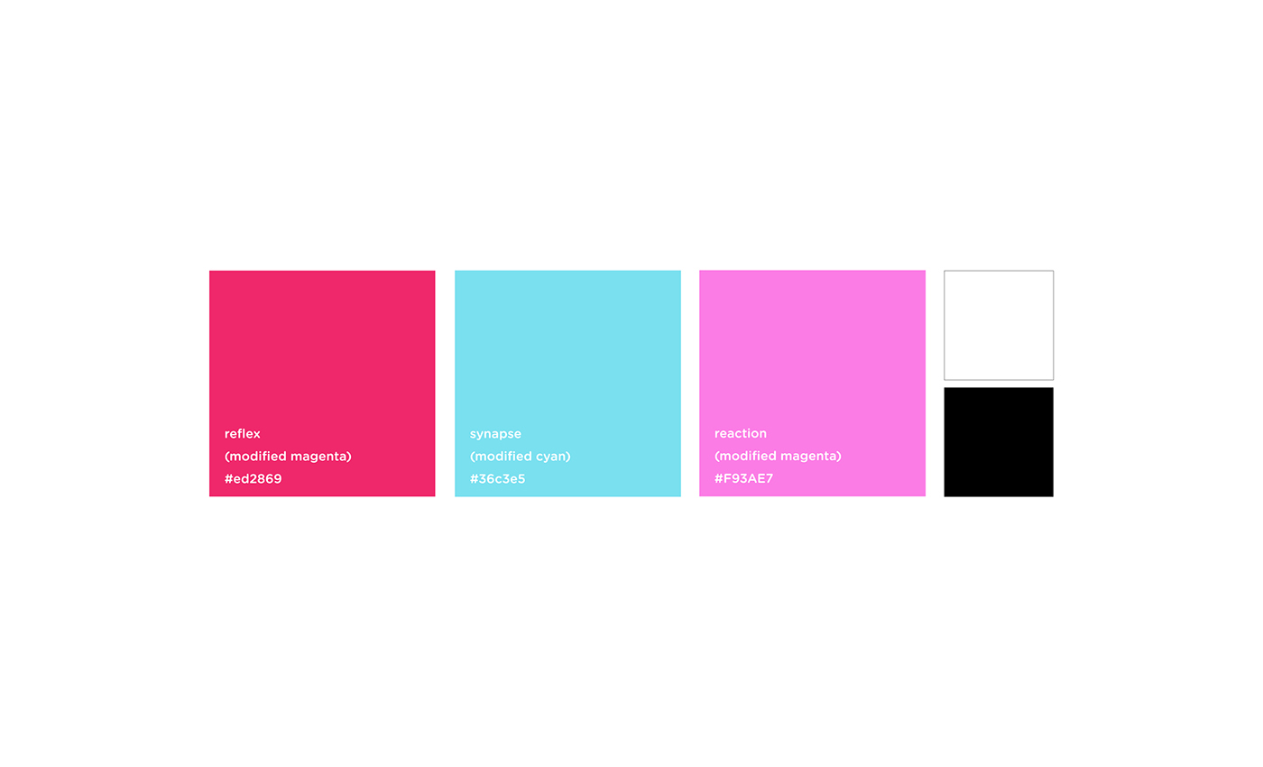
For colors, magenta and cyan were chosen initially because, although often associated with digital printing (keyword being digital). Reflex was chosen because it relates visually to the concept of the human brain; synapse was chosen because blue/cooler hues are associated with modernity, but the influence of green makes it more vibrant/electric. Reaction was chosen because its the creation of the two colors overlayed digitally, creating a third color that lays directly in between the two key hues. That being said, the colors will be used to aid both the found imagery and the digital logo.
Branding Approach
“Culture is no longer one of pure representation or narrative, where visual culture conveys messages. Instead, culture formulates, formats, channels, circulates, contains, and retrieves information. Design, therefore, is more than just the creation of visual artifacts to be used or “read.” It is also about the structuring of systems of encounter within the visual and material world” (Julier 68).
A major shift in my initial conceptualization is this concept that “words don’t matter.” Further research showed that it’s not the takeover of vision we are experiencing, but rather a shift of how we intake our information from an individualized state to a mix of visual and textual. So, instead of none of my text mattering,only key words that truly highlight mood, conceptualization and methodology will be clearly illustrated. The digital logo itself will live on its own, and the name reflection may be the only thing used in printed deliverables (if there are any).
These may include posters, as well as a publication that is entirely/almost entirely pictures. Although the logo is extremely scientific, I feel as if the techy side of the project could still be used to create very edgy, controversial imagery that follows a clear pattern of design approach. Furthermore, I want to examine deeper into screen culture, and see if it would make sense for various deliverables that would normally exist in print to live solely within the screen.
Branding Reflection
In order for my project to be successful I need to make all of my visuals read. That being said, room for interpretation in a visual society is important, and this can be achieved through making visual statements with only enough context to guide the viewer (too much and the definition will be given). My logo, name, and branding approach all make sense for the project, and I feel as if these will be able to create a clear visual system which not only creates forward design but also illustrates key components of the research.
I am happy with my font choices, and feel as if two fonts is all I need for an almost entirely visual project. My color palette is straight-forward as well; it will be able to guide and highlight the found imagery of project, but also live on its own when used in the logo, or as large blocks of flat color.
Overall, I want this project to allow for strong readability of what has become our visual culture, showing whatever base visual-emotional sensibility exist and doing so in a bold, digital manner.
Deliverables
The visual, over the last two to three decades, has emerged as a major component of our social and cultural reality. It’s not as if it was never crucial to human communication; the visual has always been treated as something of greater definition than text, and perhaps that is because so much can be said with so little. But in terms of representing who we are as a culture now, the visual has shown itself to be a necessity in electronic communication, a means of using social context to make a statement about oneself. Through the repetition of imagery, this concept snowballs until a visual cannot be seen without its cultural context at all. Visual communication is commonplace, which means that we are living in a visual culture, and a base visual/emotional sensibility does exist. Words still matter; they are crucial to communication and the formation of said context for the visual. But overall, the internet, social media, and interconnection have not made culture visual; it was always visual. It just needed a means to speak up.
Design Strategy
Reflex’s final design strategy and branding appears very scientific, using the facts of the research to heavily influence the design itself. The name implies a reaction to a changing force (the influence of postmodernism on what has become our visual culture, the visual’s representation of our society/culture as a whole, etc.), and the logo shows the interconnection of the digital world and our brain (and therefore our body, our concept of self, our identity). It only makes sense with such a heavily researched topic that that the research would need to play such a role, and the design should aid in presenting the information by playing off of what has become known to be our visual culture, base visual/emotional sensibility, and individual aesthetic/visual language.
The design strategy will focus on concepts of the viewer creating meaning from the visual, the concept of how we present ourselves (and our society) visually/online, the idea of the observer and the observed, and how communication with visuals is used to create what has become our visual culture.
Visual Publication
A “visual culture” publication, using only images of found value to create meaning and statements. Very postmodern in approach, this publication would place aesthetic over context and let the viewer draw personal definitions and story from the piece.
This piece would be an excellent companion to the poster series, showing more in-depth the role that the visual now plays in representing the status of our culture and the influence of postmodern thinking on visual culture itself. The text-less publication would leave interpretation up to the viewer (a key component of modern visual literacy), and would serve as a physical component to the overarching project.


Poster Series
A poster series consisting of one poster for each of my lenses, visually highlighting three major themes from each research topic. This would be a great way to highlight all of the major pieces that have come together to form our visual culture.
A three poster series would be a great way to take all of the research and project it visually. This would help to highlight all of the key components that have come together to create what has become our visual culture, and focus on each lens’s major topics.
For semiotics, this would include concepts of how repetition of imagery changes definitions, seeing and being seen as well as the observer and the observed, and using imagery as social currency and stand-in.
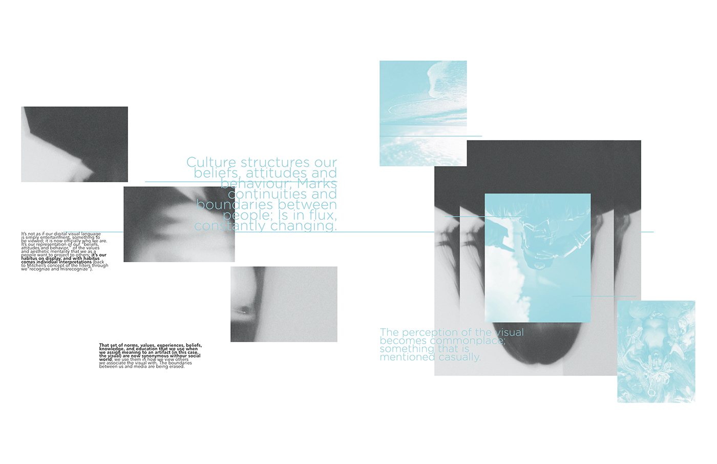
For culture, the posters would show how our visual culture structures our beliefs, attitudes and behaviors, marks continuities and boundaries, and is in flux/constantly changing.
For history, the poster would look at the relation of our modern visual culture to postmodernism, the role that the emergence of an online presence has played, and how the two come together.
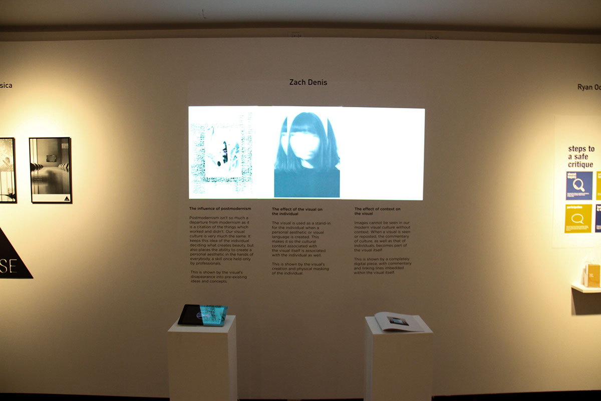
The posters would also have a projection displayed over them, showing the effect of context on the visual, the effect of the visual on the individual, and the influence of postmodernism.

This poster represents the influence of the image on the individual. This is shown through the masking of the individual with the image itself.

This poster represents the influence of postmodernism. This is shown by the projected image fading into a bed of pre-existing ideas and concepts.
The final poster space is left blank, to show the influence of context on the image. This is shown through repeated imagery and commentary overlaying the projected image itself.
Projection
Digital Anti-Logo
The digital anti-logo will be the final outcome. A logo that lives solely in the realm of the screen is the perfect metaphor for our digital culture and visual literacy. It also shows the connection of the human entity to the digital world, and the fact that it never continues to represent this concept of the observer creating meaning for the visual (since everyone will, literally, see it differently).
2016 Senior Graphic Design Capstone Show Display